FOUR COLOUR SCHEMES TO CREATE NURTURING SPACES BY TAUBMANS PAINT
The team at Taubmans® recently published the brand’s first colour trend forecast and accompanying colour palettes for Australia.
After a year-long exploration of the sentiment of Australia, the underlying theme of ‘nurture’ emerged and from this, four curated colour palettes designed for Australian homes and lifestyles. We spoke to Taubmans ‘Chief Coloursmith’ Rachel Lacy about the 2020 colour collection ‘Nurture,’ and how the four colour palettes can be used throughout the home. The key developments for 2020 are a return to clarity as the greyed off, shaded hues that dominated trends in recent seasons make way for cleaner, more uplifting tones in both stronger colours and neutrals.
SHARE
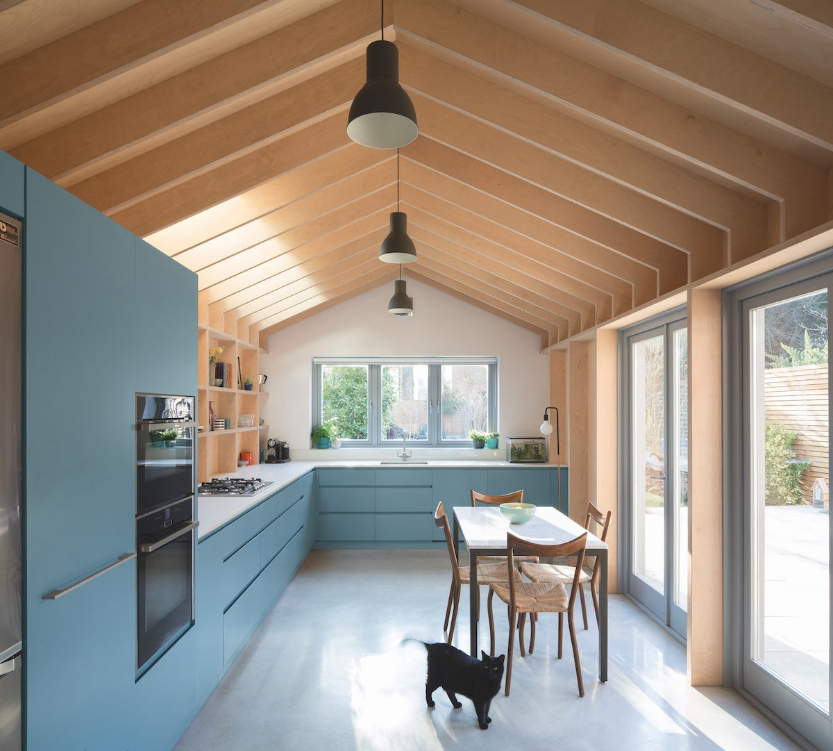
The Share colour palette has been created with multi-generational and co-living spaces in mind, reflecting on the changing shape of our lives. Even if you don’t share a home, or work or study from home, you can still draw from this lo-fi colour palette to create harmonious shared spaces. One of my favourite ways to incorporate the Share palette into the home is in the kitchen – the natural heart of any home and meeting place for cooking, baking, sharing meals and social gatherings. In this kitchen, Taubmans Dancing Waters on cabinetry meets Baked Brie on walls and Windsor trims to create a relaxed, casual and inviting space with seamless links to the outdoors.


Photo: Agnese Sanvito Architect: Nicholas Kirk Concept: Carver Haggard Detail and construction: Constructive and Co.
PROTECT
Create a cocooning shelter with the Protect colour palette, which beautifully marries the colours of the Australian outback with retrofuturistic aspirations of colonising Mars. Find luxury and reassurance where the rich warmth of the Protect palette meets natural wood, stone and clay. A stunning way to use this palette is to layer the tonal shades for a gradient effect, as has been done in this dining room. The cool pink of Taubmans Taylor Rose builds to gentle clouds of Rum Punch in graduated depths, while cool neutral furnishings in Brown Sugar, Osprey Egg and Sandlight ground and balance the space.


Chelsea Cavanaugh
CREATE
Create is a colour story for free spirits - expression before perfection reveals the artist in us all. Nurture the creative within with this bold colour palette that invites experimentation. Think punchy and personalised. Start with the colour in this palette that most appeals to you, and then add another and perhaps one more. Bold contrasts complement each other, while light and shade duos allow for a softer expression. In this sitting room, Taubmans Acid Rock takes centre stage alongside Lightly Lilac, with complementary accents in Taubmans Flashy and Wine Crush added through furnishings. Imagine starting your day with this fresh infusion of colour to kick start the senses.


Photographee.eu
BREATHE
Nature and the comfort of both spiritual and everyday rituals help to ground and reassure us in a world that sometimes feels out of control. The Breathe colour palette brings together sunlit natural blues and botanical greens to create restful, calm spaces. Sink into a blissful night’s sleep with the immersive depth of Taubmans Royal Hunter Green as the hero of this bedroom backdrop, complemented by the lightly zesty Taubmans Buttermint and cosy accessories in soft pink Premonition and deep charcoal, Knight Grey.


Photographee.eu
Home, and the places we increasingly make ourselves at home, are where we can best be ourselves, and what better way to express ourselves than through the medium of colour? We know that colour has the ability to completely alter our living spaces, to bring joy in the easiest way. To quote the Mexican architect Luis Barrágan, whose work was so strongly defined by his use of colour, “My house is my refuge, an emotional piece of architecture, not a cold piece of convenience.” As complete colour palettes purposefully designed with Australian homes and lifestyles in mind, we hope that the Taubmans 2020 Nurture collection brings you the confidence to embrace colour in your home and create a nurturing space of your very own. You can view the Taubmans 2020 Nurture colour palettes and download a copy of the colour trends book here.
Read more
OUR FIVE TIPS FOR SELLING YOUR HOME STRESS-FREE
There are few events in your life that cause more stress than selling your own home. Preparing your home for sale, trying to clean it before inspection with kids and pets, and achieving your expe...
Read more
INJECT A LITTLE COLOUR INTO YOUR NEXT PROJECT
Good design starts with inspiration. And what’s more inspiring than the hue of your favourite flowers or the vibrant tones of the perfect sunset? With the Taubmans Coloursmith app you can now captu...
Read more